
Home Buying Simplified
How might we simplify the process of the home buying journey and create a marketplace for related service providers and their services?
My Role
Timeline
Impact
Lead Product Designer
MVP Launch: 15 Months
The POC resulted in our clients successfully closing the pre-seed round within 30 days. In addition the MVP has led to a positive response of 125+ paying service providers onboarded within 2 months of Beta Launch.
The Overview
Buying a home in today's day and age, does not come without its own set of challenges. Be it the overwhelmingly complex navigation between numerous service providers and multiple touch points or be it something as simple as meeting someone in person with the onset of a pandemic. Being a home owner is a life long commitment and is a thing of pride and joy, but one does have to walk over a bed of thorns to achieve it.
Our clients wanted to make home ownership more accessible and the process of home buying journey simple for muslim and non-muslim Canadians. At the time there were no such solutions that would cater to Islamic/Ethical Financing and the end to end home buying journey.
How It Started
In 2020, two well-meaning individuals reached out to us to bring their concept to life. I joined the project as a Product Designer to help them identify problems and deliver human centred solutions. Initially the focus was on islamic financing and creating a trusted network of service providers in the housing market that Canadian muslims could depend on. As both domains; Islamic financing and home ownership were new to us, we needed to delve into research to know more.
To set things in order, we had to uncover what we knew and what we did not know to see where we stood. This helped shape our research plan and helped establish research goals. We also wanted to leverage the knowledge base of our stakeholders with respect to these topics so we started with positioning questions to help refine our area of focus.

As we were trying to understand the business and the problems we wanted to solve, I had a few underlying questions that needed to be answered. It seemed that simplifying the home journey was at the root of the mission but it seemed to be overshadowed by Islamic financing.

Before we began our research, we identified what we knew and what we did not know to help refine our research goals. This helped us steer away from redundant topics like Islamic financing products which we could leverage from our stakeholders. What we knew was collected on a mind map to visually see the data.

Research Goals
We were in a race against time. As the idea was identified as a new solution in the market, it was important that they had the first mover advantage. We optimised our research strategy to make the best use of available resources. We decided to divide our research into two phases; a primary research phase where we understood the context of the problem, conducted initial stakeholder interviews and audited existing solutions and followed by secondary research phase where we conducted contextual enquiries and then synthesised this data into an affinity map that help us build personas, focus areas, journey maps and design ideas.
-
Start with some desk research to know more about the housing space in Canada
-
Understand what the home buying journey entails, its ecosystem and its stakeholders
-
Leverage the knowledge base of our stakeholders to shed more light in Islamic financing and how it affects its ecosystem
-
Engage in conversations with known associates and stakeholders to understand the pain points of our users- both consumers and service providers.
What did we find out?
I identified the landscape for existing solutions. With the help of comparative analysis, we were able to map features the existing services focused on like being able to explore a marketplace or being able to connect with the vendors.

I consolidated all of the data we collected via my research in an affinity map so that I could form groups and categorise the data. It led me to discover some interesting insights.


My initial suspicions were also confirmed. Many non muslim Canadians were not aware of Islamic financing and frankly it did not matter to them where a good lead would come from. Islamic financing had a lot of benefits but structuring an entire product around it would result in alienating a major chunk of the demographic. This is how we were able to pivot from a product that only offered vendors who practiced ethical financing to a service that simplified the home buying journey. This did not mean that the company would not imbibe those values. Ethical Financing would become its core but the value it offered could be enjoyed by everyone.
User Persona
Based on our insights and observations from the research methods, we created four personas that captured the essence of our users and their characteristics. We also mapped their needs and frustrations.

Mind Maps and Workflows
Before we had consolidated our research, I had extrapolated data from "what we knew" in the form of a mind map so that we could make meaningful links of the information we had gathered. As we delved into our research, I kept updating our mind map. This tool was also instrumental for all the times we onboarded new resources to our team (designers / product manager / developers).

Pain Points
Understanding the current landscape for the process of buying houses helped me navigate through the pain points and roadblocks which make the home buying experience really dreadful.

Redefining the brief
Our research and insights validated that we were not far off from our original ask. Having said that we also discovered other problem areas which should be addressed to make the experience more delightful.
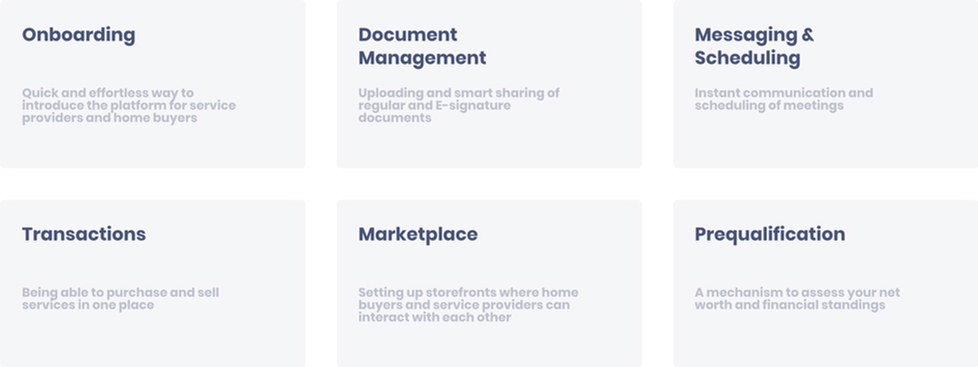
To create a space where home buyers can learn and compare different service providers as per their needs, keep track of their service providers, share and sign documents with them, communicate easily and schedule meetings with them and vice versa.
In addition Service Providers would also be able to set up a storefront, share E-signature documents and generate leads.
Ideation & Design
We used the formulation of "How Might We" questions to unlock our creative thinking and step away from a feature first approach. Rather than creating a feature and justifying it with the happy path, we instead focused on making the platform more user centric and address the issues our beloved humans were facing.

With the help of the affinity map, we narrowed down on the topics we wanted to focus on.
Information Architecture
Once we had identified the tasks we wanted our stakeholders to perform, I developed the information architecture to device a simple navigation throughout the application. This focuses more on the different features available on Souqh.

Wireframes
Even though we had identified the tasks and features we would offer, we were yet to visualise the experience. This is where the wireframes made the invisible, visible. With the help of sketches and Hi-fi wireframes, we were able to detail out the journey and the experience with this digital touchpoint.


Solution
We had streamlined the home buying journey down to 22 steps under 4 categories mainly:
-
Find Your Home
-
Fund Your Home
-
Close Your Home
-
Move Into Your Home
We rolled out our the solution in 2 phases: the Proof Of Concept (POC) and the Minimum Viable Product (MVP). The POC helped us visualise the product and we used it for testing it with different stakeholders. The POC was also instrumental during the pre-seed to receive funding.

I developed a style guide which adapted Souqh's brand language and developed a colour palate and visual language which informed our use of illustrations. I designed the subsequent screens which resulted in creating an interactive prototype which helped stakeholders including developers and product manager, to understand workflows, features and part take in the digital experience.

Minimum Viable Product
Developing the MVP was an experience, not without its challenges. From feature scoping to collaboration with development and usability testing, we overcame multiple hurdles to deliver a successful product.
Challenges
We faced many challenges from a technical perspective and actions taken in the interest of time.
-
The POC was not ready for a development handoff when the client onboarded the development team.
-
The client also undertook a rebranding exercise which resulted in a change in colour schemes, typography and visual language.
-
The web application needed to be made responsive and adapted to material design.
-
Integration of 3rd party applications into user flows and adhering to additional technical constraints that came with it.
-
There were gaps when translating design screens into development which were being missed by QA as they were prioritising functionality
Problem Solving Via Collaboration
In pursuit of tackling the challenges mentioned above, I got the opportunity to collaborate in a cross functional team of front end developers, back end developers, testers and product manager. I conducted knowledge sharing sessions with the new stakeholders who had joined the project. Based on the task flows and user goals, our product manager started creating user stories which served as a bible for the developers and testers.
-
With the help of my PM we were able to create a plan to prioritise backlogs, current sprints and future sprints thereby transforming the POC into a development ready MVP.
-
The rebranding exercise made an impact on my system to an extent as it affected the colour schemes and typography. We mitigated the changes and I incorporated the new colour scheme but held off on implementing the typeface as it was affecting legibility and visual hierarchy.
-
Understanding the box model for web development was a huge learning for me. This was critical when designing for responsive web. I created UI patterns and page templates to help my team understand how the pages would scale from a low resolution screen to a higher one.
-
I collaborated with backend developers for 3rd party integrations like SignNow or Stripe to understand how data flows through their system and what data points could we fetch to facilitate our tasks.
-
I conducted knowledge transfer sessions with Front End Developers and QA Testers to educate them about the design principles followed so that they would develop and catch flaws respectively, looking at the problem through a designer's lens.
Measuring Success
Just like data is no good without context, similarly measuring irrelevant metrics may not lead to a fruitful result. To be able to measure success, one needs to define what success looks like. I had come across the HEART framework from Google's research team. This served as an extremely useful tool to measure the product user experience.

In our scenario the HEART framework turned into HEAT as we were focusing on Happiness, Engagement, Adoption and Task Success. We did not measure Retention for the time being, as we would not have generated enough data to generate insights.

We used Fullstory and Google Analytics to track our metrics. With Fullstory we could observe user sessions and heat maps which helped us identify UX frictions. With Google Analytics we were able to observe what kind of traffic were we receiving and from where.


Conclusion
Working on this green field project was an eye opener as I discovered the magic of building products. As a designer we always aim for the happy path but all that glitters is not gold. A good value proposition does not revolve only around good design. There are many working parts and variables that contribute to the success of a product. I had a golden experience to be involved from the inception of an idea to bringing that idea to life. My role did not end at the development handoff and I saw myself going beyond disciplines and titles to deliver a successful product which resulted in over 125 paying service providers onboarded within 2 months of beta launch.
The next steps to be taken to improve in this space would be to:
-
Focus on making interactions more accessible and delightful
-
Focus on the customer journey map to reiterate problem areas and resolving them
-
Conduct quantitative research to observe user response
-
Focus on brand recognition and marketing to build brand awareness and make this product synonymous with everything home related
Take Aways
PLAN FOR THE FUTURE;
HAVE A SYSTEM
It is very rare to find yourself in the position of owning all aspects of design and even if you are there are always unforeseeable circumstances which might prevent your involvement. It is crucial that your approach to your work should systemic, scalable and open to collaboration so that any team member can jump in and continue where you left off from and doesn't impact the project.
COMMUNICATION IS KEY TO COLLABORATION
We all work better when we are on the same page. We are on the same page when we speak the same language. A cross functional team comprises of various individuals with varied backgrounds and unique perspectives. When we help each other see through our lens, the perspective shift enables us to form approaches like a jigsaw pieces fit towards a complete vision.
DEVIL IN THE DETAILS
A lot of times we take the simplest things for granted. We assume that because a feature is well known, it will not be difficult to implement but there lies the devil in complexities. It is important that we see though every single decision taken down to the last pixel. One would think what's so special about notifications as did we, only to find a goldmine of opportunity for user experience to communicate only the relevant notification for the activities taking place.